
Surfing Duckies

Surfing Duckies, our classes first project.
The task was to crop out a regular old bath toy rubber duck and than attach
eleven of those ducks to a photo of the desert. A desert which sand dooms happens
to look like waves, thus, the name Surfing Duckies.
The Purpose of this assignment was to let us explore the world of photo shop using a program called Photo Shop Elements 9. With our limited knowledge of photo editing and creating, our Communication Technology teacher sent us on our first assignment. We learned how to use certain buttons to get a different affect. All we were supplied with was a photo of the sand dooms, one classic rubber duck and a quick tutorial on how to complete this altered photo.
Step one: Crop out the original rubber duck bath toy so there is only one yellow duck.
Step two: Place Eleven ducks on the sand dooms, starting from the back and making each duck a little different in size each time.
After applying eleven little rubber ducks that appear to be surfing on the doom, we each had to add something special to our main duck. As you can see, I choose to apply a Afro complete with a fro comb and a pair of super cool white rimmed sun glasses, completing my picture. Cutting out each accessory with the lasso tool, we again drag the Afro/goggles onto the photo of the ducks and sand dooms and rearranging the sizes of the Afro/goggles to fit the head of the main duck. Finally, our assignment required us to place the title and the creator of the altered photo. I then completed this project by marking my name using the text icon and sat back proudly. Our teacher said to watch out for dirty duckies (badly cropped ducks)
Living in a Man Made Paradise

This is the second
assignment that our Communications Technology class was to complete. This is
what I like to call the man made paradise, being that this location or event
never took place in time, never existed and most likely never will.
For this assignment our task was to make a beautiful looking island using parts of other places or moments in time. We were provided with a photo of a Cruise ship coasting a grey looking watered area, a rock that stuck out of the water from a swamp land of sorts, clouds from another duller looking beach and lastly, the beach and water with a cloudy sky.
Our task was to take the beach (The one visible in this picture) and add on a more appealing sky, a cool looking rock thing and a cruise ship for good measure. To start with I and most of my classmates first took the cruise ship. Cropping this particular image out took a lot more time than anything I had done yet. In order to crop out the ship weal we had to zoom in to get rid of the sky or the water around the ship. We had to make sure to take extra care in cropping out the ship because of all the little things on the boat like people and umbrellas. The reason behind the intense care would be because the teacher said that he will be looking for any badly cropped images.
After we finished cropping out the cruise ship, we went to cutting out the rock. The rock was easy to crop out because the lumpy-ness of the trees and bushes and rocks were very forgiving. But the easiest part about creating this photo was cutting out the nice looking sky. After cutting a straight line at the horizon and the sky line, the clouds were dragged to the beach and covered the original sun and met the horizon of the waters.
Next we had to put together the rest of the requirements onto the beach. The rock was shrunk and moved further out into the water and the cruise ship was brought to the front, also shrunk down. The boat and the rock were moved around and shrunk down and enlarged until they came to look like an almost real landscape, the one you see above.
Makeover Madness
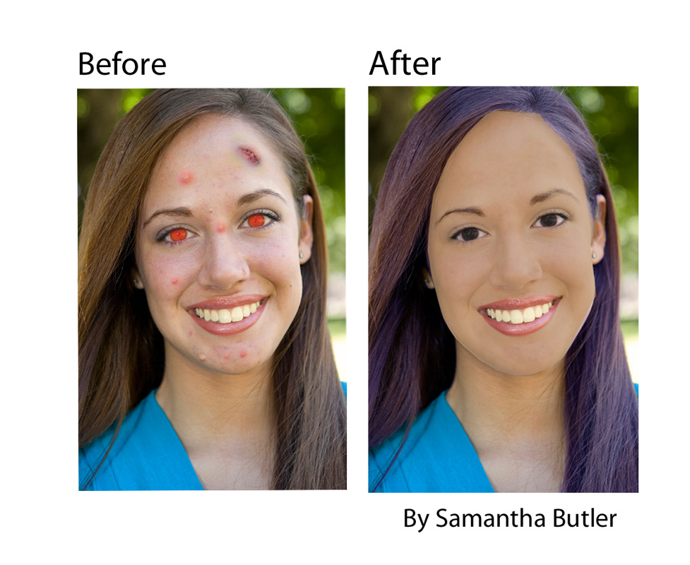
This was the classes third assignment. Our task was to fix this person's face. Of course this person did not originally start out this way, our teacher found some random person on the internet and destroyed her face with cuts and zits and blemishes. Than after making it nearly imposable to recognize this person we were given the photo and told to fix it. he wanted us to get ride of the blemishes, the red eye and whiten the teeth. We were to change the colour of her hair, give her a 'mask' and put the two different pictures on one sheet to exhibit before and after. To the person who's face was used, so sorry, but think of it this way; The faces you see above don't really exist. They are not real people anymore and never existed. Your face may have been used as a base but it has been twisted and manipulated.
He gave us a quick demonstration on how to do it and then it was our turn. First I started by getting ride of the cuts and pimples and stuff using a spot fixer tool. That's the tool with a picture of a band-aid if that was not the proper term. It was easy to use the tool. The only thing we had to do was to make the size of the circle the size of the blemish. The cut was interesting, (forehead) I used the spot tool and made it the size of the cut. What happened was that since the program takes something that is basic on the face and sticks it on the spot that you want. Since the cut was so big the computer decided that a good area to copy was one of the red eyes. Suddenly, there are three eyes on this person.
After finishing the . . . blemishes, the red eyes were next on the agenda. The button that was used for this task was a button with a picture of a little red eye. To use this tool, you draw a square around the eye and usually the program will fix the problem. Once I used the tool on this photo and it gave me half a black and half brown eyes. After getting the eyes you see above, I moved on to fixing the chick stash. I know that that was not part of what we had to do, but the look of it simply irritated me. I used the spot fixer tool for that too.
Next I did something that our teacher called a mask. This was really cool. First you had to trace the inside of the face with the lasso tool and use the colour copier and fill in the area you traced. I took a lighter area of her neck and filled it in. The result was her face a solid colour. The thing to do now is to reduce the opacity until you are satisfied. I probably could have reduced the colour a bit more. Now you are left with a mask that is see through enough so that you can see the face's details. now you take your eraser tool and erase the edges of the mask that cut into the hair or neck. than you erase part of the mask that covers the eyes, eyebrows and mouth. Than we move onto dealing with the hair colour change. I basically just tinted it with a mixture of reds and blues to get a purple effect.
When I was finally done improving the face, it was time to put it on a blank white slab adding the original and some text. I had some issues saving it and even more issues uploading it to this very site. It was because it was over a certain amount of memory, so I got ride of the funky rainbow background that tied the picture together, than making the photo saveable. :'( Good bye funky background
Movie Poster Project
Before After

Is it my nose that makes me look odd?
Movie Poster Project

This was our 4th project in my Computer technology class, and probably my favorite project yet. I think this project turned out really well. The funny thing was that it looks really well done and than once you see the original, than you realize that it does not completely look like Schwarzenegger. I think that i am most proud of this project because of how the results turned out, mostly because I am as pale as a ghost and never will or ever was that tanned.
The idea of this project was to pick your favorite movie poster and than crop your face into the main guy on the poster's face. Obviously I cropped my face were Schwarzenegger's should be. The first thing to think about during this pictures creation process is getting the photo of your face. Our teacher brought a camera in and took all our pictures. The catch was that you had to pose the way the main focus of the poster was posed. Everyone knows Schwarzenegger's famous scowl and this was the best I could do. The next thing to do after getting one or two photos was to put them on your hard rive and bring up Photoshop. Next thing I did was crop out most of the background of my picture without touching the face to make it easier and shrinking it to an estimated size. Next I cropped out his face so I could put mine there. You can not cut out the face entirely. You must make sure to leave some of his skin so you can blend it with your own. But, since I get to wear glasses, I cut around the glasses as well as I could. Than I dragged my face under the blank hole where a face originally was. I had to do the final shrinking and adjusting until I was happy.
Next I went about making the skin towns’ match. I tried the mask again like I had done in the makeover madness project but it was not working nearly as well as it had before, so in frustration I deleted the mask and tinted my face with a series of reds, yellow and oranges an got this skin town that you see before you. When satisfied with that, I Got the paint brush tool and copied colours around the face and made my face and his face mesh. The only thing that I should have done was use the shine option to match my brand new chest to my brand new face. That probably would have made it look better.
Here is a Closer Look at What Should Have Been . . . . . .

The Test
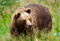
The faithful day were I and my commuter technology class would get tested on our knowledge. The task was simple. Our teacher gave us five or six different pictures and we were told to mesh them. He did not tell us how to do it but he showed us the end result of what he wanted.
We got a picture of a brown bear, some pink water, some mountains, a sky, a rock and a valley. Now we were to create what he wanted.
That's not all though. Some of the pictures were altered. The water was hot pink and the bear was a blue or purple tinge. The rest was easy to stick together. Other than cutting out all the little individual pieces, the bear and the ocean were the only things that needed a little extra attention.
Little Nicky, The New and Improved Movie Poster . . .
Poster! Go!
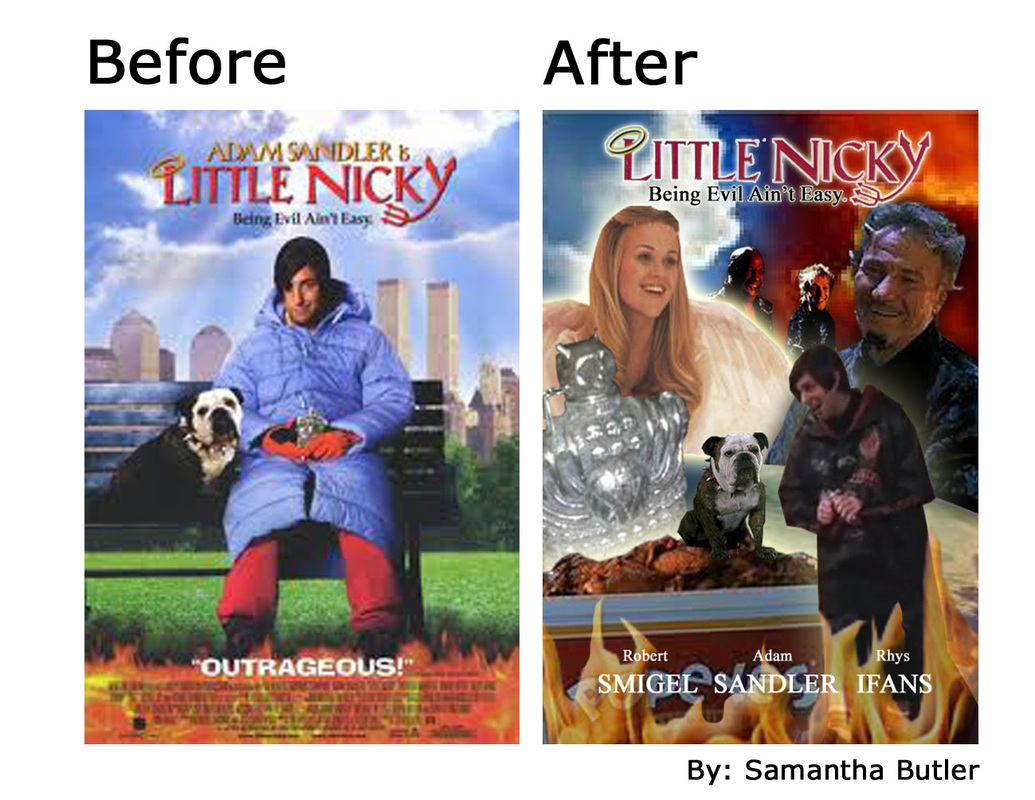
Another Movie Poster Project

This is the new and improved movie poster, brought to you by my imagination. The source of all that is creative and original. For this project, the assignment was to pick a movie that we liked like the project before. Get that movies poster and make one all your own. In this case I chose one of Adam Sandler's movies, Little Nicky.
This project required one to have an imagination. I am now deminstrating the kind of imagination I have. The first step to this is to try to figure out what you plan to do in a scetch or something. In reality, most projects don't turn out like there scetches. Either that or it's just mine that never did. None of my scetches even resembled that picture. Now you have to get all the pictures you'll need. That can sometimes be the hardest part. I had no trouble with any of the pictures except the picture of little nicky looking down at the dog right there. Apperantly no one has a picture of him standing up. I resorted to my instincts and went to youtube. I screen caped that picture of him. The only thing I would have done differently to this project wad the cropping of adam sandler. especially on his arms. those were cropped out horribly. They are far too pointy. In this project I used a lot of glowing techneks. As you can see on the angl and almost every thing alse in this picture. The only real problem I faced doing this project other than finding a good picture of adam sandler, was saving it. I think I re did this project three times in totla before it would save for me. But every time I did re do it it got better than the time before. in summary, this projetc was fun. I belive I learned the most form doing this project than any others.
This project required one to have an imagination. I am now deminstrating the kind of imagination I have. The first step to this is to try to figure out what you plan to do in a scetch or something. In reality, most projects don't turn out like there scetches. Either that or it's just mine that never did. None of my scetches even resembled that picture. Now you have to get all the pictures you'll need. That can sometimes be the hardest part. I had no trouble with any of the pictures except the picture of little nicky looking down at the dog right there. Apperantly no one has a picture of him standing up. I resorted to my instincts and went to youtube. I screen caped that picture of him. The only thing I would have done differently to this project wad the cropping of adam sandler. especially on his arms. those were cropped out horribly. They are far too pointy. In this project I used a lot of glowing techneks. As you can see on the angl and almost every thing alse in this picture. The only real problem I faced doing this project other than finding a good picture of adam sandler, was saving it. I think I re did this project three times in totla before it would save for me. But every time I did re do it it got better than the time before. in summary, this projetc was fun. I belive I learned the most form doing this project than any others.

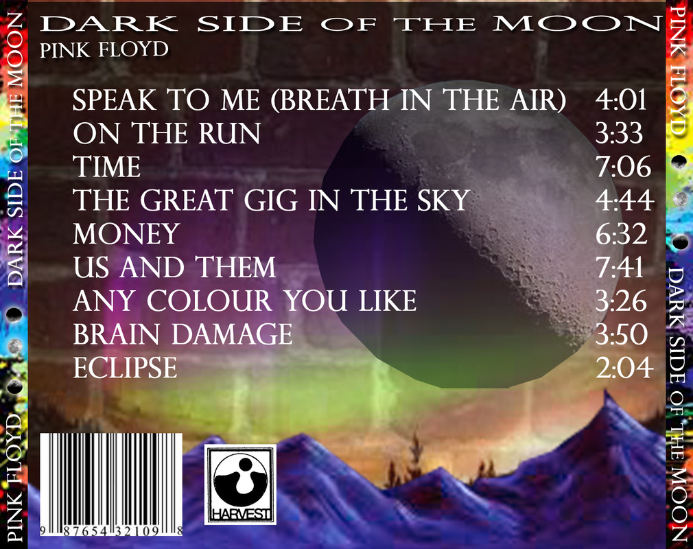
CD Cover Design Project
Pink Floyd - Dark Side of the Moon
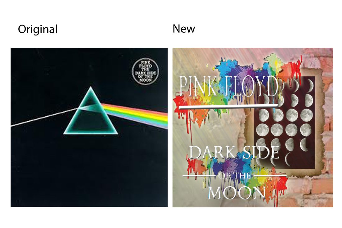
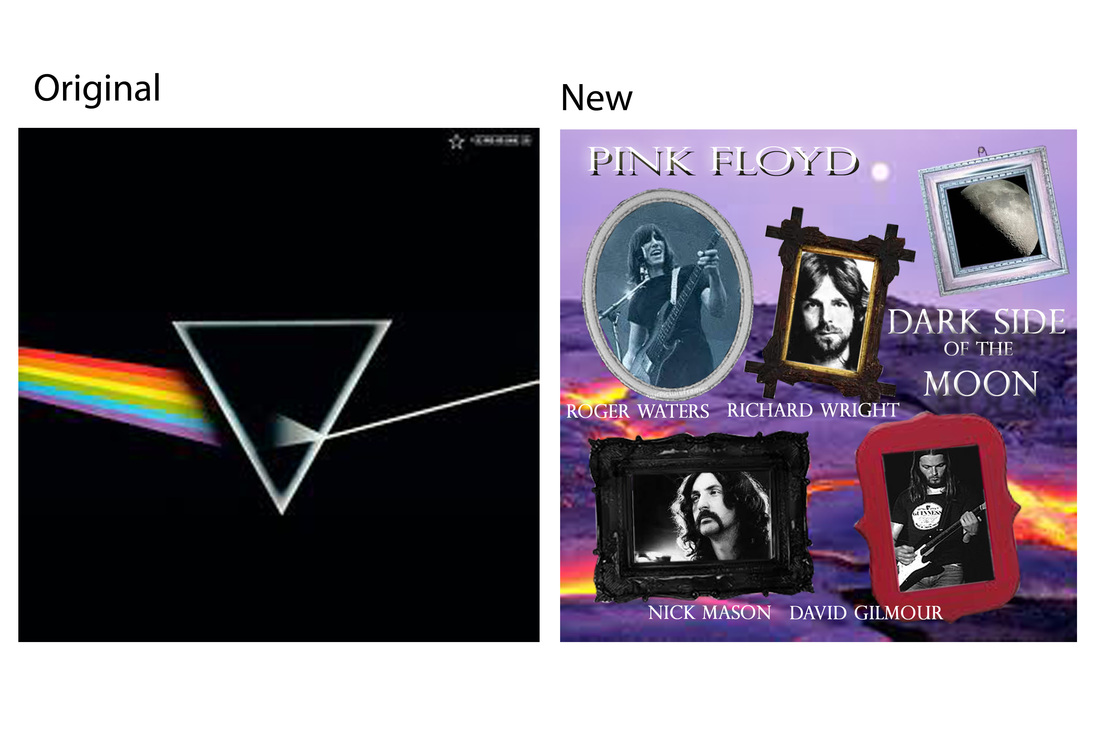
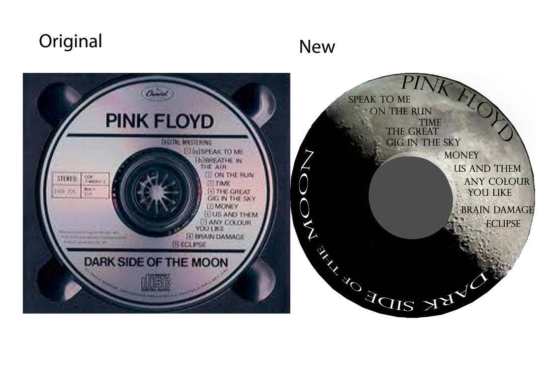
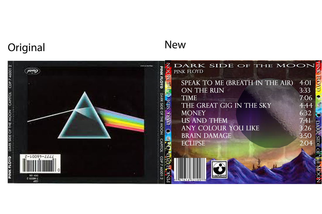
The CD Cover Design Project - minus the title page
The CD Cover Design Project is an assignment from the Communication Technology class. In this project, the scenario is that I am a first year graphic design student learning in the George Brown College Graphic Design program. Originally accepted in two different colleges, George Brown and Sheldon, I wanted to be closer to my second hobby which is music. George brown College is also closer to all my musically talented buddies from childhood and the newly uprising bands. One of the bands is starting to get pretty popular and has asked me to design a CD cover for their brand new album. I meet with their manager and agreed to a deadline of one week and signed a contract. I was asked to create an original front cover, spine, backside, an insert and a picture to be printed onto the CD.
The band I choose to represent the newly uprising band was Pink Floyd. The CD I will be designing is Dark Side of the Moon. The Musicians from my childhood friends are David Gilmour, Nick Mason, Richard Wright and Roger Waters. I choose this album because it was the first CD I ever owned. I got it on Christmas and it became very important to me. It seemed really cool to re-make the first CD cover I ever had into something completely different and completely mine. What made the choice really cool was when I heard the ‘myth’ about the album that some call the ‘dark side of the rainbow.’ When I finally saw the ‘myth’ the music and the movie completely were in sink. I just had to. After seeing it, the choice was obvious. That’s why I choose this CD to re-make.
Some problems I had making this was finding the right picture I wanted. It’s really frustrating when you have a clear picture of what you want but the computer and the inter net won’t find the right picture. Something that’s really irritating is when you decide that you want to crop something out that takes a lot of time or is very detailed, and guess what, that’s not really what you want and you end up not liking it. For exemplifying purposes, I cropped out a whole bunch of snails, and than as my cover slowly came together, the snails started to look tacky so I was forced to remove them. Another issue was measuring everything and making it fit in the CD case or on the CD itself. But the biggest problem I found was when the computer does not save your work properly and you have to restart all your work.
To solve most of these problems, there is no definite way. You just have to push through until you find something you love and something that represents you. Most things you have to experiment with and if it goes haywire than you just have to manipulate it until you’re satisfied. Some things do have solutions though. The time my Project’s cover didn’t save right and I had to re-make it, the re-making was easier the second time around and it ended up looking better too. The sizing issue was resolved by nothing more than measuring very carefully.
The project was really fun. I liked it because you were able to do whatever you wanted. It was a great assignment. It made good use of what we have for photo shop skills and your creativity. The best part for me was the album cover. The original was so bland. A black background with a colour changing triangle isn’t very much to work with. Being that the original was so plain, I could do what ever I wanted and there were no rules. This project was excellent. I recommend you do it again for another class.
| the_cd_cover_design_project.doc |
The file above is the written report that was done about the project including the title page
It should be Microsoft 3, so there should be no problems
It should be Microsoft 3, so there should be no problems


Ma Halloween Scary Face

Not my best work, a bit rushed
Unfortunatly, these are the results when you are on a time limit and run out of time. you get not the right skin colour matches.
The Walking Deadmust live on forever
The Walking Deadmust live on forever
Halloween Zombie Face Poster Project - Wright up minus the title page
1 In your own words, explain the project.
In this project, the Zombie poster design Halloween project, the idea was to demonstrate our knowledge of the program photo shop elements 9. We were to find pictures that were of an appropriate theme to Halloween and gross zombies, save them, and crop them out. Then we were supposed to add them to our own faces using the pictures that were taken before hand. The project called for 5 well photo shopped images from the internet that was well blended into our own faces. The project needed lots of forms of creativity and imagination. The project needed us to create a zombie from our original faces and right the words ‘Happy Halloween.’ This project was a way to use our skills in photo shop, get evaluated and marked, and create a Halloween poster to celebrate the season and coming holiday that is Halloween.
2 Did you use 5 images from the internet? What were they?
Yes, I did use 5 different images from the internet. The images were: An open jaw exposing fake teeth, a black eye, a big bloody gross weird looking patch thing that was placed on my right eye, a small little area that had two scratches, and, lastly, I used an image of simply a large gouge or cut.
3 What elements or principals of design did you use in this project? (Explain)
I used balance by centering all of the images and words. I also attempted balance by trying to match myself or body with the words. I used texture on my face and inserted wounds. For line, I had a lot of negative space in the background. It has a lot of unity and texture.
4 What tools did you use to create your design?
I used the crop button, the band aid button, the paint brush, eraser, eye dropper tool, the grab tool, etc.
5 Did you run into any problems when completing this project? How did you solve them?
As you can tell, I ran out of time around the end of the project and was forced to quickly finish the project without much detail. The way to fix it is to simply just try to get it done. Another issue was that it did not save properly the first couple times so I had to start over each time. Modern Technologies never seem to save properly leaving most with nothing. For this, there is no solution. Another problem is that it is hard to find good pictures that appeal to my personal image that I have when I start the project. Again, there is no solution. Another problem is that I forgot to put my name in the lower right corner. Again, no solution. Most answers for problems are nothing more but pushing through the problem and just keep on continuing.
6 Out of 10, how would you rate this project?
I find that question confusing. If you mean the results of my own project, I would say 6 ½ to 7. If you mean the project itself, I thing 8 ½. The project allowed the person to be able to use their creativity and knowledge of the program and create something that will cause laughter years after. It was a good project. The only thing I would do differently if I were to give the project to the class would be giving the project more time.
Magazine Cover Design Project

| magazine_cover.doc_20q.doc |
If you don't like it move on and get over it
1 Reflection; describing the project and what elements and principals you used in the design.
This project, I was to design a magazine cover about myself. I had to pick a magazine and base 4 titles about myself on it. I just put things that I like to make in my spare time, Sock monkeys, robots and making something new out of something old.
In this project I used some Elements and Principle of design. Some of which are balance. I used balance with the words. Placing them opposite to the other words and myself. Doing that balanced the picture because the way the cover looks as a whole is even and balanced out. I used Texture with the different lines and back rounds and textures. With the use of all the colours on my cover, it gave it more of a smooth feel. The Background I used showed a bit of the craftiness of the cover.
A little Extra

This was just a little project for myself where I take some things that I like and make a header . . . . . . No big deal
